Read Your Solar System Like a Pro: What Every Wire and Number Really Means
Updated:
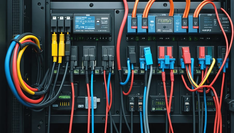
Locate the single-line diagram in your solar system documentation—it’s your roadmap to understanding how energy flows from panels through inverters to your home’s electrical panel. This schematic shows every critical component: charge controllers, battery banks, breaker boxes, and safety disconnects, all connected by lines representing wire runs with their corresponding voltage ratings.
Start by identifying the DC (direct current) side versus the AC (alternating current) side of your system. Solar panels generate DC power, which travels through combiner boxes and charge controllers before reaching batteries or inverters. The inverter converts this to AC power that your home appliances use—this conversion point is where most troubleshooting begins when systems underperform.
Learn to read the symbols: circles with plus/minus signs represent batteries, rectangles with wave patterns indicate inverters, and boxes with diagonal arrows show your solar array. Wire gauge numbers (like 10 AWG or 6 AWG) tell you the thickness of cables, while amp ratings on breakers reveal maximum current capacity—both critical for diagnosing voltage drops or overheating issues.
When your monitoring system flags errors or you notice reduced output, trace the problem backward through your diagram. A sudden power loss? Check the breakers and disconnects in sequence. Batteries not charging? Follow the path from panels through the charge controller. Understanding your diagram transforms mysterious technical alerts into specific, fixable problems you can address confidently without expensive service calls.
Why Solar System Diagrams Matter More Than You Think
I’ll be honest with you—when I first installed my DIY solar setup five years ago, I treated the system diagram like that instruction manual you toss in a drawer and never look at again. Big mistake. Three months later, when my batteries weren’t charging properly, I found myself staring at my system completely lost, unable to explain the problem to anyone or even know where to start looking.
That diagram isn’t just a piece of paper you need for installation day—it’s your system’s DNA, the roadmap to your energy independence. Think of it this way: you wouldn’t buy a car without understanding where the gas tank is or how to pop the hood, right? Your solar system deserves the same respect.
Here’s why keeping that diagram handy (and actually understanding it) matters more than you might think:
**Troubleshooting becomes manageable.** When something goes wrong—and eventually, something always does—your diagram shows you exactly how electricity flows through your system. Is your inverter acting up? The diagram reveals what’s upstream and downstream, helping you isolate the issue without calling an expensive technician for every hiccup.
**Performance optimization gets easier.** Understanding your system layout helps you spot inefficiencies. Maybe you’ll realize your panels are wired in a configuration that’s causing shading issues, or you’ll discover opportunities to adjust charge controller settings based on how your components connect. Pairing this knowledge with reliable solar system monitoring solutions creates a powerful combination for keeping your system running at peak efficiency.
**Safe upgrades become possible.** Want to add more panels or upgrade your battery bank? Your diagram shows you whether your current components can handle the expansion and where new equipment should connect.
**Professional communication improves dramatically.** When you do need expert help, speaking the language of your diagram means clearer conversations, accurate quotes, and faster solutions. No more expensive misunderstandings or unnecessary service calls.
Your solar diagram transforms you from someone who just owns a solar system into someone who truly controls their energy future.
Understanding how solar panels connect in your array is the foundation for reading system diagrams and troubleshooting power flow issues.
The Essential Components Every Solar Diagram Shows
Solar Panels: Where Your Energy Journey Begins
In most solar diagrams, panels appear as rectangles with a grid pattern or diagonal lines—simple visual shorthand for “this is where sunlight becomes electricity.” But here’s where it gets interesting: *how* those rectangles connect tells you everything about your system’s personality.
When I first started tinkering with solar, I thought all panels just linked together randomly. Wrong! Series connections (panels linked positive-to-negative, like a chain) increase your voltage while keeping amperage the same. Think of it like stacking batteries. Parallel connections (all positives together, all negatives together) do the opposite—same voltage, boosted amperage. In diagrams, you’ll see straight lines between panels showing these relationships.
Why does this matter? Series configurations work great for long cable runs and higher-voltage inverters. Parallel setups shine when you’ve got shading issues or want more consistent output. Most residential systems use a hybrid approach—strings of series-connected panels running parallel to each other.
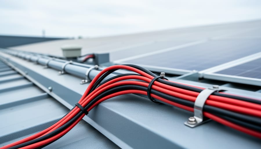
Those connection lines aren’t just decorative. Thicker lines often indicate higher current paths, while labeled lines show voltage at different points. Understanding this becomes crucial when testing solar panels or troubleshooting underperformance—you’ll know exactly where to measure and what numbers to expect.
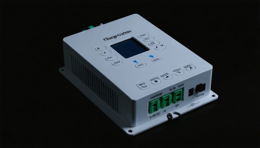
Charge Controllers: Your System’s Traffic Cop
Think of your charge controller as the traffic cop directing electricity between your solar panels and batteries—it’s constantly making split-second decisions to keep everything flowing safely and efficiently. On your solar system diagram, you’ll typically spot the charge controller as a rectangular box positioned between your panels and battery bank, often labeled with “MPPT” or “PWM.”
Here’s what you need to know: **MPPT (Maximum Power Point Tracking)** controllers are the sophisticated option, usually represented with more detailed connection points on diagrams. They’re like having a GPS that constantly finds the best route—optimizing power harvest even in less-than-perfect conditions. **PWM (Pulse Width Modulation)** controllers appear simpler on diagrams because they’re more straightforward devices, perfect for smaller systems.
When I first examined my own system diagram, I remember being confused by all those lines. Here’s the secret: look for **three main connection sets**—input from panels (usually at top), output to batteries (typically at bottom), and sometimes a load output for direct device connection.
Pro tip: Your diagram should show wire gauge specifications near these connections. If you’re troubleshooting charging issues, checking these connection points first often reveals loose terminals or corroded wires—the most common culprits I’ve encountered.
The charge controller serves as the central hub of your solar system, regulating power flow from panels to batteries.
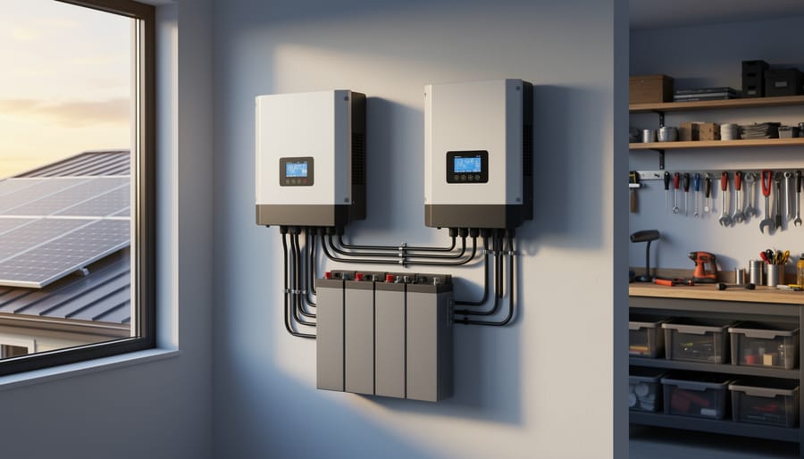
Battery Banks: Reading Storage Capacity and Health
When you look at battery banks in solar diagrams, you’ll typically see rectangular boxes with positive and negative terminals, often stacked or arranged side-by-side. Understanding how these batteries connect is crucial for knowing your system’s actual storage capacity.
Here’s the fundamental principle: batteries wired in **series** (positive to negative) increase voltage while maintaining the same amp-hour capacity. If you connect two 12V, 100Ah batteries in series, you get 24V at 100Ah. Conversely, **parallel connections** (positive to positive, negative to negative) keep voltage the same but add amp-hours together—two 12V, 100Ah batteries in parallel give you 12V at 200Ah.
I remember Charles telling me about a common mistake he made early on: he thought adding more batteries always meant more runtime. “I wired four batteries in series and wondered why my 12V fridge wouldn’t turn on,” he laughed. “Turns out I’d created a 48V bank!”
Most diagrams use connecting lines between batteries to show these configurations. Thick horizontal lines between terminals indicate parallel connections, while vertical connections typically show series arrangements. Some systems use **series-parallel combinations**—multiple strings of series-connected batteries linked in parallel—to achieve both higher voltage and greater capacity. Understanding these patterns helps you calculate your actual usable storage and identify potential issues.
Battery banks require precise wiring configurations that directly impact your system’s voltage and storage capacity.
Inverters: Decoding the AC/DC Switch
In most solar diagrams, you’ll spot the inverter as a rectangular box positioned between your solar panels and your home’s electrical panel—think of it as the translator that converts DC power from your panels into the AC electricity your appliances understand.
When I first started tinkering with solar systems, I remember staring at inverter symbols wondering what all those wavy lines meant! Those wavy lines actually indicate sine waves, and here’s where it matters: **pure sine wave inverters** (shown with smooth, regular waves) produce clean power identical to your utility company’s electricity, perfect for sensitive electronics like laptops and medical equipment. **Modified sine wave** inverters (depicted with stepped or blocky wave patterns) are budget-friendly but can cause humming in some appliances.
Pay attention to the connection points radiating from your inverter symbol. Arrows flowing *into* the inverter represent DC input from your panels, while arrows flowing *out* connect to your loads—that’s everything using power in your home. Many diagrams also show a monitoring connection, often labeled with a small WiFi symbol or computer icon, which links to those handy apps that let you track your system’s performance in real-time.
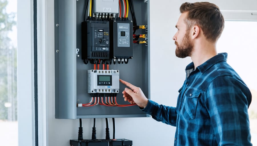
The Supporting Cast: Fuses, Breakers, and Disconnects
When I first started reading solar diagrams, I glossed right over those little rectangular symbols scattered throughout—big mistake! Those boxes represent your system’s safety guardians: fuses, circuit breakers, and disconnects. Think of them as your solar system’s emergency exits and fire extinguishers—hopefully you’ll never need them, but their proper placement can prevent equipment damage or even fires.
On your diagram, you’ll typically spot these components at critical junctions: between your panels and charge controller, before your battery bank, and on both sides of your inverter. This strategic placement creates “protection zones” that isolate problems quickly. If something goes wrong with your inverter, for example, the disconnect switches let you safely cut power from both directions.
Here’s a practical tip: grab a highlighter and trace each protection device on your diagram, following the wire from source to load. Notice how nothing connects directly to your battery without passing through at least one protective element? That’s intentional design! Understanding this layout helps you troubleshoot safely—you’ll know exactly which breaker to flip before working on any component. Most diagrams label these with amp ratings too, giving you upgrade limits at a glance.
Decoding the Lines: What Connections Tell You About Power Flow
Think of the wires in your solar diagram as highways for electricity—some are multi-lane expressways, others are narrow country roads. Understanding these “lines” is crucial for diagnosing issues and optimizing your system’s performance.
**Wire Gauge: Size Really Does Matter**
Wire thickness (gauge) determines how much current can safely flow through without overheating or losing efficiency. In your diagram, thicker lines typically represent heavier gauge wires (remember, lower gauge numbers mean thicker wires—14 AWG is thicker than 18 AWG). I learned this the hard way during my first installation when I used 12 AWG wire for a 40-foot run to my battery bank. The voltage drop had my panels working overtime for mediocre results! Now I always check the diagram’s wire specifications against the actual distance and amperage requirements.
**Following the Flow: Positive, Negative, and Ground**
Your diagram should clearly mark positive (+) and negative (-) connections, often with red and black lines respectively. The positive wire carries current from your panels to the charge controller and eventually to your batteries or inverter. The negative wire completes the circuit back. Ground connections—typically shown as green or bare copper—provide a safety path for stray electricity, protecting you and your equipment from dangerous faults.
Trace the entire path with your finger on the diagram. From panel to controller, controller to battery, battery to inverter, and finally to your home’s electrical panel. Each connection point is a potential weak spot.
**Spotting Bottlenecks Before They Spot You**
Look for these warning signs in your diagram: undersized wires for the distances shown, multiple connections spliced together (more resistance), or missing fuses at critical junctions. If your diagram shows a 20-amp charge controller but 30-amp capable panels, you’ve found your bottleneck—you’re leaving power on the table!
Pro tip: Calculate voltage drop using our interactive wire sizing calculator. It’ll tell you if those lines connecting your components are highway-ready or headed for traffic jams. When voltage drops exceed 3%, you’re losing efficiency and potentially money. Your diagram holds these secrets—you just need to know how to read them.
Reading the Numbers: Voltage, Amperage, and Wattage on Your Diagram
When I first looked at my solar system diagram, those voltage and amperage numbers felt like alphabet soup. But here’s the thing—these numbers are actually your system’s secret language, telling you exactly how your components work together. Let me walk you through reading them like a pro.
**Understanding Voltage (V)**
Think of voltage as the electrical “pressure” in your system. You’ll typically see 12V, 24V, or 48V on residential diagrams. This number must match across compatible components—trying to connect a 12V solar panel to a 24V battery is like trying to fit a square peg in a round hole. When I upgraded my cabin setup, I learned this the hard way after buying incompatible panels!
The voltage listed on your diagram shows what each component expects to receive or deliver. Your solar panels might show “18V open circuit” (what they produce with no load) and “36V maximum power point” (their sweet spot during operation). These distinctions matter when sizing your charge controller.
**Decoding Amperage (A)**
Amperage measures the flow of electricity—imagine it as the volume of water through a pipe. On your diagram, you’ll see amp ratings on wires, fuses, and connections. These ratings tell you the maximum current that component can safely handle. If your solar panels produce 10A combined but your wire is only rated for 8A, you’ve got a fire hazard.
Look for “rated current” or “maximum current” specifications. Your charge controller should handle at least 25% more amperage than your panels produce, giving you a safety buffer.
**Calculating Wattage (W)**
Wattage is simply voltage multiplied by amperage (W = V × A). This tells you actual power consumption or production. A 300W panel at 18V produces roughly 16.7A. Understanding this relationship helps you verify that everything on your diagram adds up correctly.
**Using Numbers for Troubleshooting**
When something’s not working, these numbers become diagnostic gold. Is your battery charging too slowly? Compare your panel’s rated output against what you’re actually getting with accurate solar readings. Significant differences point to shading issues, damaged panels, or faulty wiring.
Check Spheral Solar’s online calculators to verify your system’s numbers match theoretical performance. These tools help you quickly identify whether your readings fall within normal ranges or signal problems needing attention. Remember, understanding these specifications isn’t about memorizing formulas—it’s about confidently knowing whether your system is healthy or needs some TLC.
Regular diagnostics using your system diagram helps identify voltage drops and efficiency issues before they become costly problems.
Common Diagnostic Scenarios: What Your Diagram Reveals
When Your Batteries Won’t Charge Fully
When your batteries refuse to reach full charge, your system diagram becomes your troubleshooting roadmap. Start at the solar panels and work your way downstream—think of it like following a river to find where the flow gets blocked.
First, check your panel connections. I learned this the hard way when Charles once discovered a loose MC4 connector had been robbing him of 30% charging capacity for weeks! Your diagram shows exactly where these connection points should be, making it easier to spot loose wires or corroded terminals. You can even test panels without a multimeter using simple voltage checks.
Next, trace the line to your charge controller. Is it properly sized for your panel array and battery bank? A mismatched controller can’t deliver what your batteries need. Check the amp ratings on your diagram against your actual components—they should align.
Finally, examine the battery connections themselves. Sulfation, loose terminals, or even a single failing battery in a bank can prevent full charging. Your diagram reveals the battery configuration (series or parallel), helping you identify which connections might be causing voltage drops or imbalanced charging across your bank.
Troubleshooting Power Losses and Efficiency Drops
Your diagram is your detective tool when things aren’t performing as expected. Here’s how I learned to track down power losses after noticing my system wasn’t hitting its rated output.
Start by comparing expected versus actual power at each connection point. Your diagram shows the theoretical voltage and amperage at every stage—from panels through charge controllers to batteries. Using a solar power meter, measure actual values at these same points. Any significant difference (typically more than 10-15%) signals a problem area.
Look for voltage drops between components, which indicate resistance issues. If your panels produce 18 volts but only 16 volts reach the charge controller, you’ve got losses in the wiring—often from undersized cables, corroded connections, or loose terminals.
I discovered a 20% efficiency drop in my first setup simply by following the power flow on my diagram. The culprit? A connection I’d thought was “tight enough” but was actually creating resistance.
Check shaded panels separately—even partial shading can reduce output dramatically. Your diagram’s series connections show how one underperforming panel affects the entire string. Temperature differences matter too; panels produce less power when hot.
Finally, battery charge-discharge efficiency appears on your diagram. If batteries aren’t holding expected capacity, trace backwards to identify if the issue is charging current, depth of discharge cycles, or aging cells.
Planning Safe Upgrades and Expansions
Your solar system diagram isn’t just a record of what you’ve built—it’s your roadmap for future growth. Before adding that extra panel or upgrading your battery bank, pull out your diagram and let’s do some math together.
First, check your charge controller’s capacity. If your diagram shows you’re running 400 watts of panels through a 30-amp controller, you’ve got room to grow. Most controllers can handle 20-30% more than you’re currently using, but don’t push it to the absolute limit. I learned this the hard way when I added “just one more panel” and ended up replacing my controller during a summer heatwave—not fun!
Next, trace your wire gauges on the diagram. Adding components means potentially increasing amperage, and those wires need to handle the extra load without overheating. Your diagram should show existing wire sizes, making it easy to calculate if upgrades are needed.
Battery expansion requires special attention to maintaining balance. If you’re adding batteries, they must match your existing bank in voltage, capacity, and chemistry. Mark proposed additions on your diagram first, then verify all connections maintain proper parallel or series configuration.
Think of your diagram as a living document. Sketch potential upgrades in pencil, calculate the numbers, and only commit when everything checks out safely.
Creating Your Own Solar System Diagram for Better Diagnostics
Creating your own solar system diagram might sound intimidating, but trust me—it’s one of the smartest investments of your time. When I first documented my setup, I thought I’d remember where everything went. Six months later, when troubleshooting a mysterious voltage drop, I was kicking myself for not having a proper diagram. Don’t make my mistake!
The good news? You don’t need fancy software to get started. Free tools like Draw.io, Lucidchart’s free tier, or even Google Drawings work perfectly well. For smartphone users, apps like SimpleMind or Concepts let you sketch diagrams right on your phone while standing next to your system. The key is choosing something you’ll actually use and update.
Your diagram should include several essential details. Start with the obvious: panel locations and their wattage ratings, your charge controller model and settings, battery bank specifications (voltage, amp-hours, and type), and inverter details. But here’s where most people stop—and they shouldn’t. Add wire gauge information between components, fuse or breaker ratings, and most importantly, the date you created or updated the diagram. I also recommend noting serial numbers and purchase dates for warranty purposes.
Color-coding your diagram makes troubleshooting exponentially easier. Use red for positive connections, black for negative, and green for grounding. If you have monitoring equipment or sensors, mark those in blue. This visual system helps you trace problems quickly when something goes wrong.
Here’s my favorite part about documenting your system: sharing it with the community. Online forums and solar enthusiast groups thrive on real-world examples. When you post your diagram (removing any sensitive personal information, of course), you’re not just helping others learn—you’re inviting experienced folks to spot potential issues you might have missed. I’ve caught three wiring inefficiencies in my system thanks to community feedback, saving hundreds in energy losses.
Keep your diagram accessible but secure. Print a laminated copy to store near your system, save a digital version in your cloud storage, and maybe keep another copy in your home’s maintenance folder. Update it whenever you make changes, no matter how small. That five-minute update today could save you hours of head-scratching tomorrow.
Understanding your solar system diagram isn’t just about reading lines and symbols—it’s about taking control of your renewable energy journey. You now have the tools to decode those technical drawings, troubleshoot issues before they become expensive problems, and communicate confidently with professionals when needed.
I remember the first time I successfully traced a voltage drop using my system diagram. That “aha!” moment transformed how I viewed my installation—it went from being a mysterious black box to something I genuinely understood and could maintain myself.
Here’s my challenge to you: grab your system documentation right now and spend fifteen minutes walking through your diagram with fresh eyes. Trace the power flow, identify each component, and verify that you understand how your specific setup works. You’ll be amazed at what you notice the second time around.
Remember, you’re not alone in this. The Spheral Solar community is here to support you—whether you’re stuck on a confusing schematic symbol or want to share your latest diagnostic victory. Drop your questions or experiences in the comments below. What did you discover about your system today? What’s still puzzling you? Let’s figure it out together.
How useful was this post?
Click on a star to rate it!
Average rating 0 / 5. Vote count: 0
No votes so far! Be the first to rate this post.
We are sorry that this post was not useful for you!
Let us improve this post!
Tell us how we can improve this post?
charlesnoble
Here at Spheral Solar, I’m a hands-on solar power enthusiast, constantly exploring and experimenting with DIY solutions. I’m dedicated to sharing my discoveries, insights, and even the bumps I hit along the way, all in the pursuit of a more sustainable future.
Your Multimeter Can Tell You Everything About Your… by Charlesnoble March 8, 2026 Grab your multimeter and set it to AC voltage mode—typically marked as “V~” or “VAC”—which allows you to measure the alternating current output from your solar inverter, the device that converts your panels’ DC power into usable household electricity. You’ll want to verify that your system is delivering the standard…
Why Your RV Solar Panels Aren’t Charging (And How to… by Charlesnoble November 30, 2025 Check your multimeter readings at each connection point along your solar charging path—from panels to charge controller to battery—to pinpoint exactly where voltage disappears. Most RV solar systems lose 10-30% of their potential power to voltage drop, but this invisible thief often goes undetected until you systematically measure and compare…
Why Your DIY Solar Project Needs a Calibrated… by Charlesnoble February 3, 2026 Point your infrared thermometer at your solar panel surface on a sunny afternoon, and you might get a reading of 145°F—but is that number actually accurate? Without proper calibration, that measurement could be off by 10, 20, or even 30 degrees, leading you to misdiagnose hot spots, overestimate efficiency losses,…
Why Your DIY Solar System Needs 3-Phase Power… by Charlesnoble December 26, 2025 Check your electrical panel right now—if you see three thick cables entering your home or property instead of two, you’re already working with 3-phase power, and standard single-phase monitoring won’t give you the complete picture of your solar system’s performance. This matters more than most DIY solar enthusiasts realize: a…
Your DIY Solar Inverter Might Be Wasting Power… by Charlesnoble March 31, 2026 Measure your inverter’s efficiency by comparing DC input power to AC output power using a simple multimeter—a ratio below 95% signals it’s time to investigate performance issues. Track voltage and current readings at both the solar panel array and your home’s load center during peak sun hours, then multiply volts…
Why Your Solar Meter Numbers Don’t Match Your… by Charlesnoble January 20, 2026 Look at your solar meter display right now and locate the kWh reading—this number tells you exactly how much electricity your panels have generated since installation, and if it’s climbing daily, your system is working. Check whether your meter’s digital arrows or symbols are moving forward (you’re using solar power…
Subscribe for handpicked DIY projects, exclusive tips, and giveaways.
Route your PV wires through UV-resistant conduit within 18 inches of leaving the solar array, securing it every 3 feet with proper clamps to prevent wind damage and code violations. This single step prevents 80% of the wire degradation issues I’ve seen in DIY solar installations over the past decade. Group your positive and negative… Read more: Why Your PV Wire Management Could Fail Inspection (And How to Fix It)
Understand that 6000 volts sounds terrifying but delivers surprisingly low amperage—typically around 120 milliamps for just 3/10,000th of a second per pulse. This combination creates an unforgettable shock that trains animals to avoid the fence without causing lasting harm. The voltage pushes current through thick fur and hide, while the minimal amperage and microsecond duration… Read more: Why 6000 Volts Won’t Kill Your Livestock (But Will Stop Predators Cold)
Check the maximum voltage and current ratings first—these determine whether your controller can actually handle your solar panel array without frying itself on the first sunny day. I learned this the hard way when my first DIY system shut down every afternoon because I’d paired 600 watts of panels with a controller rated for only… Read more: Why Your Solar Setup Needs Both a Charge Controller and Inverter (And How to Pick the Right Ones)


")
")
")
")
")
")
")
")
")
")
")
")