Why Your Solar System Needs an Energy Conversion Diagram (And How to Read One)
Updated:
Sketch your solar system’s energy flow on paper before buying a single component—start with the sun at top, draw arrows through your solar panel, charge controller, battery, and finally to your devices, labeling each conversion point with estimated percentages of energy loss. This simple visual reveals exactly where your power goes and why that 100-watt panel doesn’t deliver 100 watts to your phone.
Map the voltage transformations at each stage by writing the input and output values beside every component: your 18-volt panel drops to 12 volts at the charge controller, stays at 12 volts in the battery, then converts to 5 volts through your USB adapter. These numbers expose the hidden losses that catch most beginners off-guard when their systems underperform.
Calculate your actual usable energy by multiplying efficiency percentages backward from your end device—if you need 50 watt-hours daily and each conversion step loses 15%, you’ll discover you actually need an 80-watt panel, not the 50-watt one you initially considered. Energy conversion diagrams transform vague hopes into concrete shopping lists.
I learned this the hard way during my first camping solar setup when I couldn’t figure out why my “powerful” system barely charged my laptop. Drawing out the energy path revealed I’d lost nearly 40% of my power to inefficient conversions I hadn’t even considered. That one diagram saved my next three projects from the same expensive mistakes.
These visual roadmaps work whether you’re powering a weekend camping trip or designing a whole-home backup system. They force you to account for every watt, every conversion, and every loss point that separates your theoretical power from what actually reaches your devices.
What Exactly Is an Energy Conversion Diagram?
Understanding how energy flows through solar panels and components helps DIYers optimize their system design and avoid costly mistakes.
The Building Blocks: Understanding Energy Flow
Let me break this down in a way that clicked for me when I first started playing around with solar panels on my camper van. Think of an energy conversion diagram as a roadmap showing exactly where your power goes from the moment sunlight hits your panel to when it charges your phone.
Every energy conversion diagram has four essential building blocks. First, you’ve got your input, the energy source coming in. For solar enthusiasts like us, that’s sunlight hitting the panel, measured in watts per square meter. Second is the conversion stage, where the magic happens. Your solar panel transforms light into electricity through those photovoltaic cells. Third, you’ll see the output, the usable energy that comes out the other end, typically measured in watts or kilowatt-hours. Finally, and this is the part that surprised me initially, you have losses shown along the way.
Here’s a simple example: Imagine 1000 watts of sunlight hitting your 100-watt rated panel. Your diagram would show that input, then the conversion happening inside the panel. But here’s the reality check, you won’t get 100 watts out. The diagram reveals losses from heat (typically 15-20 percent), reflection off the panel surface (another 3-5 percent), and inefficiencies in the cells themselves. Your actual output might be closer to 75-80 watts under real-world conditions.
Understanding these building blocks helps you troubleshoot problems and set realistic expectations for your solar projects. When you see where energy disappears, you can make smarter decisions about panel placement, cooling, and system sizing.
Why Solar DIYers Actually Need These Diagrams
Here’s the honest truth I learned after my first solar project flopped: I bought components based on specs that looked impressive, only to discover they didn’t play well together. An energy conversion diagram would have saved me hundreds of dollars and weeks of frustration.
These diagrams are your financial safety net. Before you click “buy” on that shiny new charge controller, mapping out your energy flow helps you spot where you’re losing power and why. Maybe your inverter is bleeding 15% efficiency, or your battery chemistry isn’t optimal for your climate. A simple diagram reveals these issues on paper, not in your driveway surrounded by incompatible equipment.
Think of it as a dress rehearsal for your wallet. By visualizing each conversion step from solar panel to usable power, you’ll catch mismatches in voltage, identify bottlenecks, and understand whether right-sizing your system means adding panels or upgrading your battery bank. You’ll also troubleshoot problems faster when something goes wrong, because you already know how energy should flow through your setup. It’s like having a roadmap when you’re lost, instead of wandering aimlessly with a multimeter.
Reading Your First Energy Conversion Diagram
Following the Energy Path
Let me walk you through how energy actually moves through your solar setup. I learned this the hard way during my first installation when I couldn’t figure out why my batteries weren’t charging as expected. Understanding the energy path changed everything.
Start with the sun hitting your solar panels. This is where the journey begins. Your panels convert sunlight into DC electricity, but here’s the first reality check: you’ll lose about 15-20% right off the bat. Solar panels are typically only 80-85% efficient under real-world conditions, accounting for heat, dust, and the angle of the sun.
Next, that DC power travels through your charge controller to your batteries. If you’re using a PWM controller, expect another 10-15% loss. MPPT controllers are better, keeping losses around 5%. This is why I always recommend spending a bit more on quality controllers.
Now your energy sits in the batteries, but storage itself isn’t perfect. Battery efficiency ranges from 85-95%, meaning you’ll lose another 5-15% during the charge and discharge cycle. Lead-acid batteries are on the lower end, while lithium batteries perform better.
The final conversion happens at your inverter, transforming DC back to AC power for your household devices. Quality inverters run at about 90-95% efficiency, so factor in another 5-10% loss here.
Let’s trace a complete path with real numbers. If your panels capture 1000 watts of solar energy, you might see 820 watts after panel losses, 750 watts after the charge controller, 650 watts after battery storage, and finally around 600 watts reaching your appliances. That’s a 40% total system loss, which is actually pretty normal for a typical home solar system. Understanding these losses helps you size your system correctly from the start.
Spotting Where Your Energy Goes Missing
Here’s where things get interesting—and where I learned some hard lessons with my first DIY setup. Every time energy changes form in your solar system, some of it sneaks away, usually as heat. Your energy conversion diagram isn’t just tracking the wins; it’s revealing the losses too.
Let’s talk real numbers. A typical solar panel converts sunlight at roughly 15-20% efficiency, meaning 80-85% of that sunshine never becomes electricity. It just warms up your roof instead. I remember being shocked when I first calculated this for my camping rig—all that energy just vanishing!
Your charge controller adds another 5-10% loss during the DC-to-DC conversion process. Then, if you’re running AC appliances, your inverter takes its cut—anywhere from 10-15% depending on quality. These percentages matter tremendously when you’re planning system capacity, which is why understanding electrical unit conversions becomes crucial for accurate calculations.
Here’s a practical example: Start with 1000 watts of sunlight hitting your panel. After panel losses, you’re down to 180 watts. The charge controller drops you to about 165 watts. Run that through an inverter, and you’re looking at roughly 145 watts actually powering your devices. That’s less than 15% of what you started with!
Mapping these losses on your diagram helps you spot where upgrades might help most and sets realistic expectations for your system’s actual output.
Creating Your Own Energy Conversion Diagram
Mapping Your Solar Components
Before you can create an effective energy conversion diagram, you need to take inventory of your solar system’s key players. Think of this as creating a cast list for your energy journey. Each component plays a specific role in converting and managing power, and understanding where energy transforms is crucial.
Start with your solar panels, the stars of the show. These convert sunlight into DC electricity, typically operating at 15-22% efficiency for most consumer-grade panels. I remember when I first mapped out my van’s solar setup – those panels seemed simple until I realized how much their angle and temperature affected actual output.
Next comes your charge controller, the often-overlooked guardian that regulates power flowing to your batteries. PWM controllers run at about 75-80% efficiency, while MPPT controllers achieve 93-97%. This difference matters more than you’d think, especially when running battery capacity calculations.
Your batteries are energy storage champions, converting electrical energy to chemical energy and back. Expect 80-90% round-trip efficiency for lithium batteries, while lead-acid typically delivers 70-85%.
Finally, if you’re running AC appliances, your inverter converts DC back to AC power. Pure sine wave inverters operate at 90-95% efficiency, modified sine wave models at 85-90%.
Walk through your system physically, noting each component and its rated efficiency from the manufacturer’s specs. This becomes your roadmap for understanding where energy transforms – and where losses occur. Having this list makes troubleshooting and optimization infinitely easier down the road.
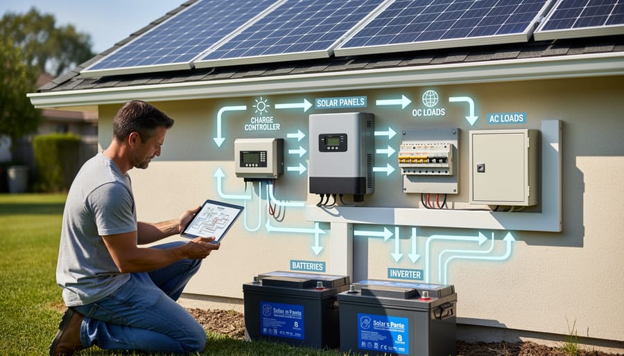
Each component in your solar system converts energy with some efficiency loss, from charge controllers to inverters to batteries.
Calculating Energy at Each Stage
Here’s where the magic happens – turning your energy conversion diagram from a simple sketch into a powerful planning tool! Let me show you how to calculate the actual energy at each stage of your solar setup.
The basic principle is straightforward: energy decreases as it moves through your system due to conversion losses. Think of it like pouring water through a series of filters – you lose a bit at each step.
Let’s work through a real example I use with my camping setup. Say your 100-watt solar panel produces energy for 5 hours of good sunlight. First, you need to convert watts to watt hours – that’s 100 watts × 5 hours = 500 watt-hours of potential energy.
Now apply your efficiency percentages at each conversion point. If your charge controller operates at 95% efficiency, multiply: 500 Wh × 0.95 = 475 Wh actually reaching your battery. Next, your battery might have 90% charge/discharge efficiency: 475 Wh × 0.90 = 427.5 Wh of usable stored energy. Finally, if you’re running an inverter at 85% efficiency to power AC devices: 427.5 Wh × 0.85 = 363 Wh available to your devices.
See the pattern? You started with 500 Wh but ended up with 363 Wh – that’s about 73% overall efficiency. This calculation helps you understand why your devices don’t run as long as you might expect!
For battery charging scenarios, our charge time calculator does these calculations automatically, but understanding the math helps you troubleshoot and optimize your system. Write these numbers directly on your energy conversion diagram at each stage, and you’ll have a complete picture of where your energy goes.
Drawing It All Together
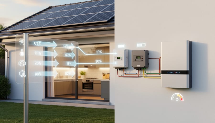
Ready to create your own energy conversion diagram? Start by grabbing paper and colored pencils, or use free online tools like Draw.io or Canva. Begin with a simple box for your energy source (like your solar panel), then draw arrows showing the flow to each component. Label each conversion step with the type of energy and any losses as heat. I usually sketch mine during morning coffee—it really helps visualize where your system might be wasting energy! For precise numbers to include in your diagram, check out Spheral Solar’s interactive calculators. They’ll help you determine realistic conversion percentages for your specific setup. Don’t worry about making it perfect—even a rough sketch on a napkin can clarify how your solar system actually works. The key is capturing those energy transformations in a way that makes sense to you.
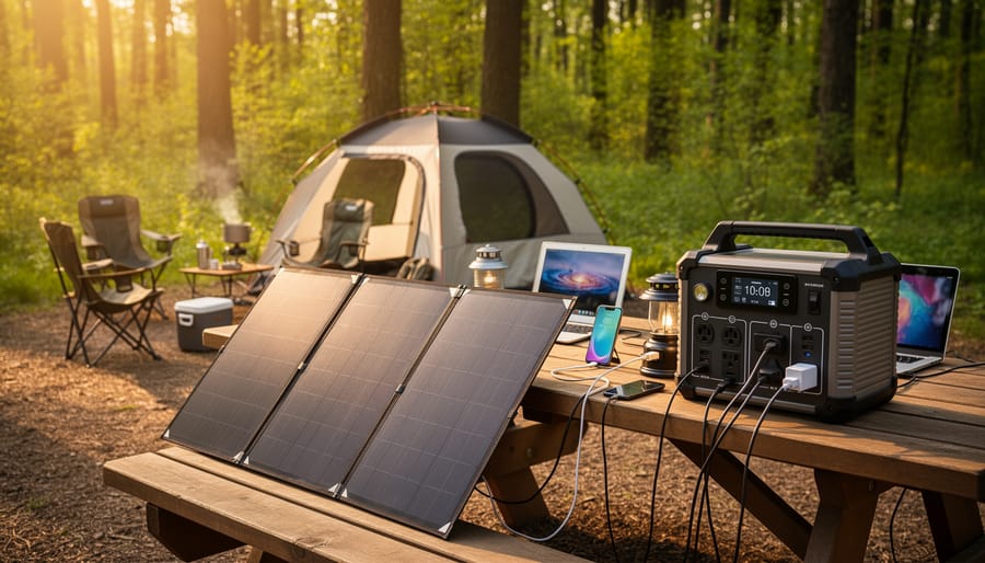
A well-planned portable solar setup demonstrates how energy flows from sunlight through each component to power your camping needs.
Real-World Example: A Camping Solar Setup
Let me walk you through a camping setup I helped my friend Sarah design last summer. She wanted to power her weekend trips without relying on noisy generators, and a 200W portable solar panel seemed perfect for her needs.
Here’s how the energy conversion flows in her system. The 200W solar panel sits in the sun collecting photons and converting them into direct current electricity. In ideal conditions, that’s 200 watts of input energy. However, Sarah camps in Colorado where conditions aren’t always perfect, so we calculated her real-world output at about 160 watts on average (accounting for panel angle, clouds, and temperature effects).
That DC electricity travels through a charge controller, which is the first conversion point. The charge controller regulates the power flow to protect her 100Ah lithium battery from overcharging. This process loses about 5% of energy to heat, so 160 watts becomes roughly 152 watts entering the battery.
The battery stores this energy chemically. When Sarah needs to power her devices, the stored energy converts back to DC electricity. Battery discharge efficiency is typically 95%, so we’re down to about 144 watts of usable power.
Here’s where it gets interesting. Sarah’s camping gear includes LED lights (12V DC), a laptop charger (requires AC), and USB phone chargers. The LED lights run directly off the battery with minimal loss. But that laptop needs an inverter to convert DC back to AC power. Inverters typically operate at 85-90% efficiency, so her effective power for AC devices drops to about 122-130 watts.
The complete diagram shows five conversion stages: sunlight to DC (panel), DC regulation (controller), electrical to chemical storage (battery), chemical back to electrical (discharge), and DC to AC (inverter). Each stage chips away at the original 200 watts.
The math is straightforward: 200W × 0.80 (panel efficiency) × 0.95 (controller) × 0.95 (battery) × 0.87 (inverter) = approximately 125W of usable AC power. That’s enough for Sarah’s laptop and lights simultaneously, with plenty of margin for her morning coffee maker.
Common Mistakes and How to Avoid Them
I’ve made my fair share of mistakes with energy conversion diagrams over the years, and I’m sharing them here so you can skip the headaches I’ve experienced. Trust me, learning from my errors will save you time, money, and frustration.
The biggest mistake I made early on was forgetting about conversion losses. I once designed a small camping setup and calculated that my 100-watt solar panel would perfectly match my 100-watt-hour battery needs. Sounds logical, right? Wrong. I completely ignored that charge controllers aren’t 100% efficient, batteries lose energy during charging, and inverters consume power during conversion. My system fell short by nearly 25%. Now I always account for at least 15-20% total system losses in my diagrams, mapping out where each loss occurs.
Another common error is using average sunlight hours instead of realistic conditions. I planned a project assuming my area got 5 peak sun hours daily because that’s what online calculators told me. But I didn’t consider cloudy days, winter months, or panel angle inefficiencies. My diagram looked perfect on paper but failed in real-world conditions. Now I always multiply my theoretical numbers by 0.75 to account for real-world performance variations.
Oversimplifying parallel loads is another trap. I once added up all my devices thinking they’d run sequentially, but forgot that refrigerators cycle on while lights are already running. My wiring couldn’t handle the simultaneous draw. Always diagram your worst-case scenario where everything runs at once.
Finally, don’t round numbers too aggressively during calculations. Those small decimals add up. I lost nearly 50 watts of capacity once by rounding down at each conversion step. Keep at least one decimal place throughout your calculations, then round conservatively at the end. Your future self will thank you when your system actually performs as expected.
Now you’ve got the tools to harness the power of energy conversion diagrams for your solar projects. I can’t stress enough how much these simple sketches have saved me from costly mistakes over the years. That time I almost bought a charge controller twice the size I actually needed? A quick diagram showed me exactly what my system required, keeping several hundred dollars in my pocket.
The beauty of mapping out your energy flow is that it takes the guesswork out of solar planning. You’ll know precisely what components you need, where energy losses might occur, and how to troubleshoot when something doesn’t perform as expected. No more crossing your fingers and hoping everything works together.
Before you click “buy” on your next solar panel or battery bank, grab a piece of paper and sketch out your energy conversion diagram. Track the sunlight coming in, follow it through your charge controller, watch it store in your batteries, and see how it transforms to power your devices. Those fifteen minutes of planning could save you hours of frustration and hundreds of dollars in wrong-sized equipment.
I’d love to hear how energy conversion diagrams work for you. What insights did you discover about your system? Did you catch a potential issue before it became expensive? Share your experiences with our community, your story might just help a fellow DIYer avoid a headache.
How useful was this post?
Click on a star to rate it!
Average rating 0 / 5. Vote count: 0
No votes so far! Be the first to rate this post.
We are sorry that this post was not useful for you!
Let us improve this post!
Tell us how we can improve this post?
charlesnoble
Here at Spheral Solar, I’m a hands-on solar power enthusiast, constantly exploring and experimenting with DIY solutions. I’m dedicated to sharing my discoveries, insights, and even the bumps I hit along the way, all in the pursuit of a more sustainable future.
Wire Your Solar Panels Wrong and Watch Your… by Charlesnoble December 22, 2025 Match your wire gauge to your system’s amperage before making a single connection—undersized wire creates dangerous heat buildup and wastes the energy you worked hard to capture. For most residential 12V systems running under 30 amps, 10 AWG copper wire handles the load safely, but calculate your specific needs using…
Stop Burning Out Your Solar Gear: Why Electrical… by Charlesnoble February 22, 2026 Grab your multimeter and calculator—understanding electrical conversions transforms confusing numbers into actionable data for your solar setup. When I first started working with solar panels, I’d stare at spec sheets showing watts, amps, and volts, completely baffled about which numbers actually mattered for sizing my components. That confusion nearly led…
Why Your Solar System Needs a Usage Graph (And How… by Charlesnoble March 11, 2026 Check your solar inverter’s display screen or manufacturer app right now—most modern systems already generate real-time usage graphs without additional equipment. Your inverter likely shows daily production curves, typically peaking between 11 AM and 2 PM, which gives you instant insight into whether your panels are performing as expected. Download…
How Batteries Actually Convert Energy (And Why It… by Charlesnoble April 27, 2026 A battery converts chemical energy stored within its cells into electrical energy that powers your devices—a fundamental transformation that makes everything from your smartphone to your off-grid solar setup possible. Understanding this energy conversion isn’t just academic knowledge; it’s the foundation for choosing the right batteries, calculating how long they’ll…
Why Joule Solar Energy Matters More Than Watts for… by Charlesnoble February 11, 2026 Picture this: You’re browsing solar panel specs and suddenly see energy output measured in joules, watt-hours, and kilowatt-hours all mixed together. Confusing, right? I’ve been there myself, standing in my garage with a handful of solar equipment brochures, wondering why some manufacturers use joules while others stick to watts. That…
Stop Tripping Your Solar System: Size Your 3-Phase… by Charlesnoble April 19, 2026 Calculate your three-phase breaker size by multiplying your load’s full-load current by 1.25, then selecting the next standard breaker rating above that value. For a 40-amp three-phase motor, you’d calculate 40 × 1.25 = 50 amps, meaning you need a 50-amp breaker minimum. Verify your voltage system first—208V, 240V, 480V,…
Subscribe for handpicked DIY projects, exclusive tips, and giveaways.
Monitor your greenhouse temperature daily during peak sun hours—if it consistently exceeds 85°F or condensation builds up on interior surfaces, you’re losing crops to heat stress and creating the perfect environment for fungal diseases. A greenhouse solar ventilation fan addresses both problems without adding a penny to your electricity bill, making it one of the… Read more: Why Your Greenhouse Needs a Solar Ventilation Fan (Before Summer Hits)
Press and hold the adjust button (usually bottom-left) on your G-Shock for three seconds until the time display starts flashing—this unlocks manual time adjustment on most models. Navigate between hours, minutes, and date using the mode button, then use the forward/reverse buttons to change values. If you own a radio-controlled G-Shock with Multi-Band 6 technology,… Read more: How to Adjust Time on Your G-Shock Solar Watch (Without Breaking It)
Picture this: you’ve just installed your third solar panel on the roof, wires dangling everywhere, and suddenly you realize your two-panel string needs to connect with your new addition. You need a solar branch connector, but you’re staring at product listings wondering if you’re about to make an expensive mistake. Solar branch connectors are the… Read more: Why Your Solar Array Needs Branch Connectors (And How to Install Them Right)


")
")


")
")